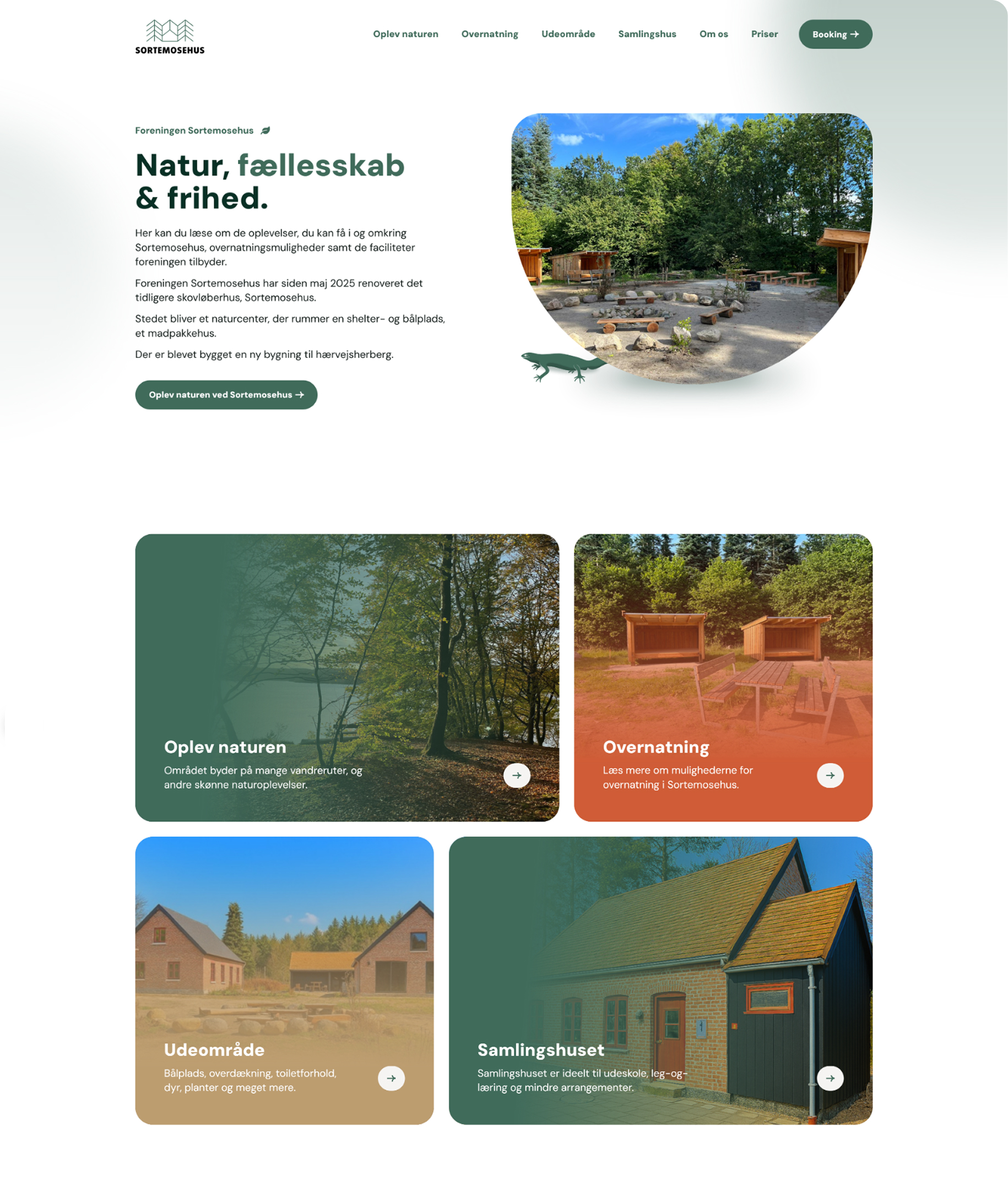
We developed a comprehensive visual identity—including logo, color palette, and typography—reflecting Sortemosehus’ natural surroundings and strong sense of community.
The website was designed emphasizing intuitive navigation, personality, and mobile responsiveness.
Striking a balance between eye-catching and elegant is a fun challenge. We didn’t want the design to be loud but it couldn’t be boring either.
Keeping the face of the box mainly clean, with the subtle half-tone wave pattern as a background, allows the logo ample space to breathe. The sides of the box, with the cool banana leaf graphic, provides a nice contrast, that also conveys Lajmi’s sustainable message.
Striking a balance between eye-catching and elegant is a fun challenge. We didn’t want the design to be loud but it couldn’t be boring either.
Keeping the face of the box mainly clean, with the subtle half-tone wave pattern as a background, allows the logo ample space to breathe. The sides of the box, with the cool banana leaf graphic, provides a nice contrast, that also conveys Lajmi’s sustainable message.